So you’ve made a basic page, but after checking out some of the Page of the Month winners, you realize it’s boring. Who wants their character to have a boring page? If you want to learn a few things for improving the look of your page, keep reading. Almost everything you can do is going to involve CSS. This guide will only cover the simple things.
Preview
When you edit your MediaWiki page, there is a preview button. Use it. In fact, I’m going to tell you how to change the edit page. Along the top right of the page is a preferences link. Click on it. Go to the edit link. I have the preview show up below the edit box and that’s the setting I recommend you try. If you need to do most of your editing in the box provided, you can actually make it longer. I leave it alone since I copy and paste from a file on my computer.
I also recommend tracking your changes by briefly describing what you did in the summary box, even if it’s only a minor edit. It’s good for you to track what you’ve changed and anyone following knows exactly where to find the new changes.
When editing and previewing, you can hit the ‘Home’ key on your keyboard to go to the top of the page.
Colors
 What colors you choose are important. If you’re using more that one, they should compliment each other. It’s easiest to use two or three colors, such as the ones of your character. Not sure how colors would look together? Try using the Color Designer.
Normally, I would suggest using the colors of your character. For Sterga’s page, I used a neutral color (light grey) for the base color and red for accents, headers, and links. Other neutral colors: dark blue, black, white, brown.
Links
Basic links are boring and default colors can be impossible to read with your page colors. Good thing you can change them. The bad part is that you have to do each link individually.
“Bunni B.O.T.” is the actual MediaWiki page link. Everything after the “|” is what you see on the page. You can call the link whatever you want and use most CSS. It’s best to make your links stand out from the body of the text. What’s the point of having links if you can’t tell them apart from the rest of the sentence?
Fancy External Link:
Image
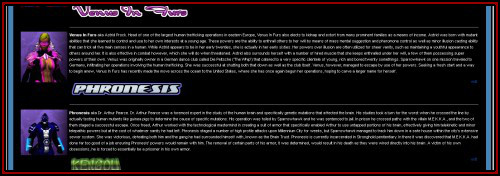
It’s important to break up your text with images, but try not to go overboard. The more images you have in a section, the harder it is to place them and still look good on the page. The simplest way to position images is to use the alignment option in the wiki markup:
Which will cause the image to float right. There is another option that allows you to do more using CSS. Floating simply means the image can sit next to blocks of text or other images instead of being part of a sentence. You can see the difference by removing the “|right” part of the markup and previewing the page.
This gives you much greater control of how the image looks, a nicer border, and padding for text next to the image. You can see how useful CSS is when combined with other elements such as a heading with the same background color as the image border.
Fix For Images Breaking Layout
 Sometimes, floating an image will break the layout. That’s OK, there’s an easy solution.
You can use this style anywhere images overflow into section you don’t want them to. If you use a hero box, this will affect that as well. You can also use clear:left or clear:right. If you have an image close to the top that you don’t want running into the next section and you have a hero box, then using clear:left is better than clear:both.
Having this CSS before or as part of section headings prevents images from spilling into places you don’t want them.
The clear style in CSS simply tells thing that are floating to stop at that point.
Headings
 The default headings leave a lot to be desired. Sure, you can make them bold or italic, but that’s boring. You can use CSS to make all of your heading much better. You can even use a mix of wiki markup and CSS if you prefer. If you’re using HTML heading (<h1>, <h2>, <h3>, etc), MediWiki encourages you not to use <h1>. I choose to ignore this.
As you can see, there are many options to make your sections look much nicer. This one is simple. I use the top three heading levels. My top level headings stand out more than the other two. As I add different levels, they stand out less and less.
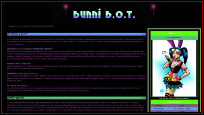
 You can also use images. Many people use Cool Text to make appealing section headings. There are several ways to create text headings. The most common way is to simply add the image to the heading and some background color.
== <div style=”background:#FA0;”>[[CaligaNotes.png|link=]]</div> ==
Nothing fancy here.
Other Useful Wiki Markup
I very rarely use Wiki Markup, choosing to use HTML and CSS instead. There are some codes you may want to use. You can read up on MediaWiki formatting which gives you the basics you need to make the page look pretty. Making a bunch of slashes is faster than using HTML and CSS, so you may want to use these markups instead.
””’This is bold and italic.””’
== Level 2 Heading ==
=== Level 3 Sub-heading ===
These two are put at the top to remove the table of contents and the edit link on section headings. I normally create my own menu and do my editing on my computer. Both of these things are useless to me. If you don’t edit using the wiki, there’s no point in having edit links.
__NOEDITSECTION__
Credits & Links
This is a link to all of the people I used as models or mentioned. Give their pages a look for ideas on creating your own.
W3Schools – Tutorials and references for HTML and CSS.
Color Designer – Allows you to play with various colors, figuring out complimentary colors, seeing how text would appear, viewing sample layouts, and even checking how your page looks to someone who is color blind.
Cool Text – The fancy text generator many use to create their headings and title.
MediaWiki formatting – Most of the basic formatting you can use on your wiki page.
SparowHawk – Bunni B.O.T. – Caliga – CORP Forums
